
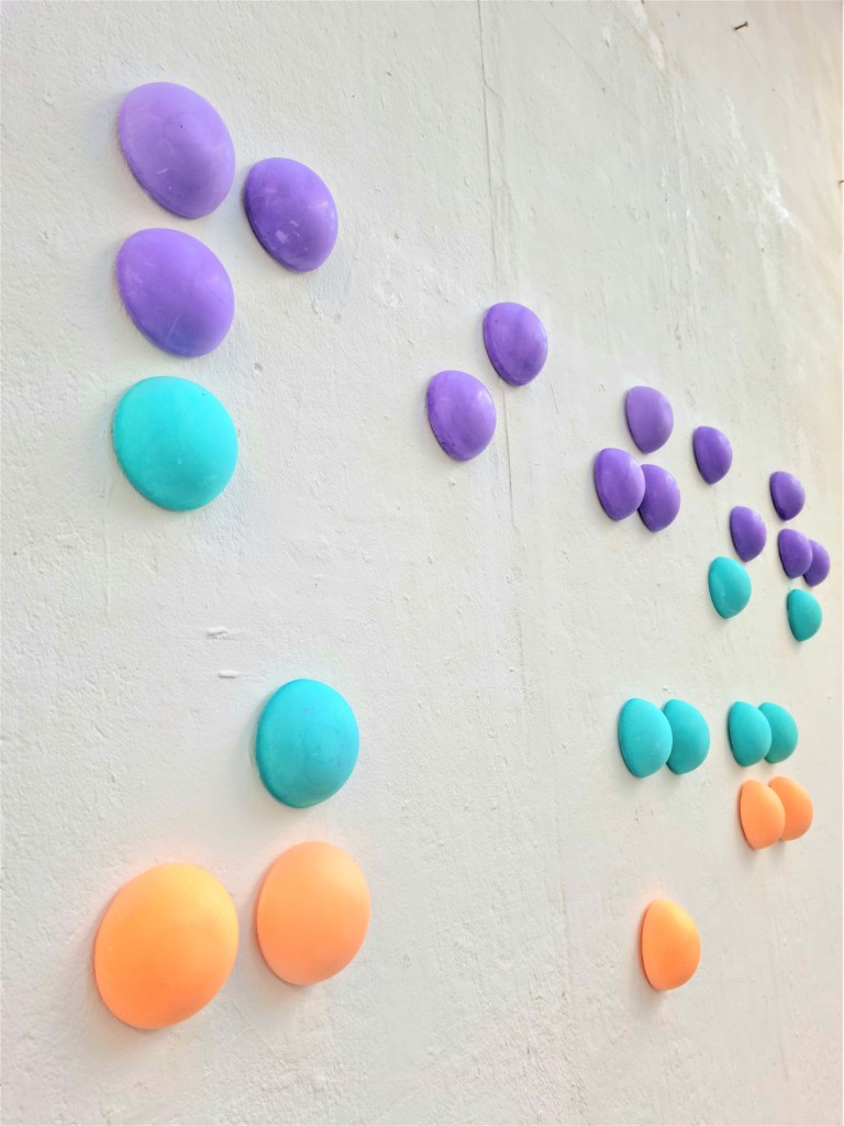
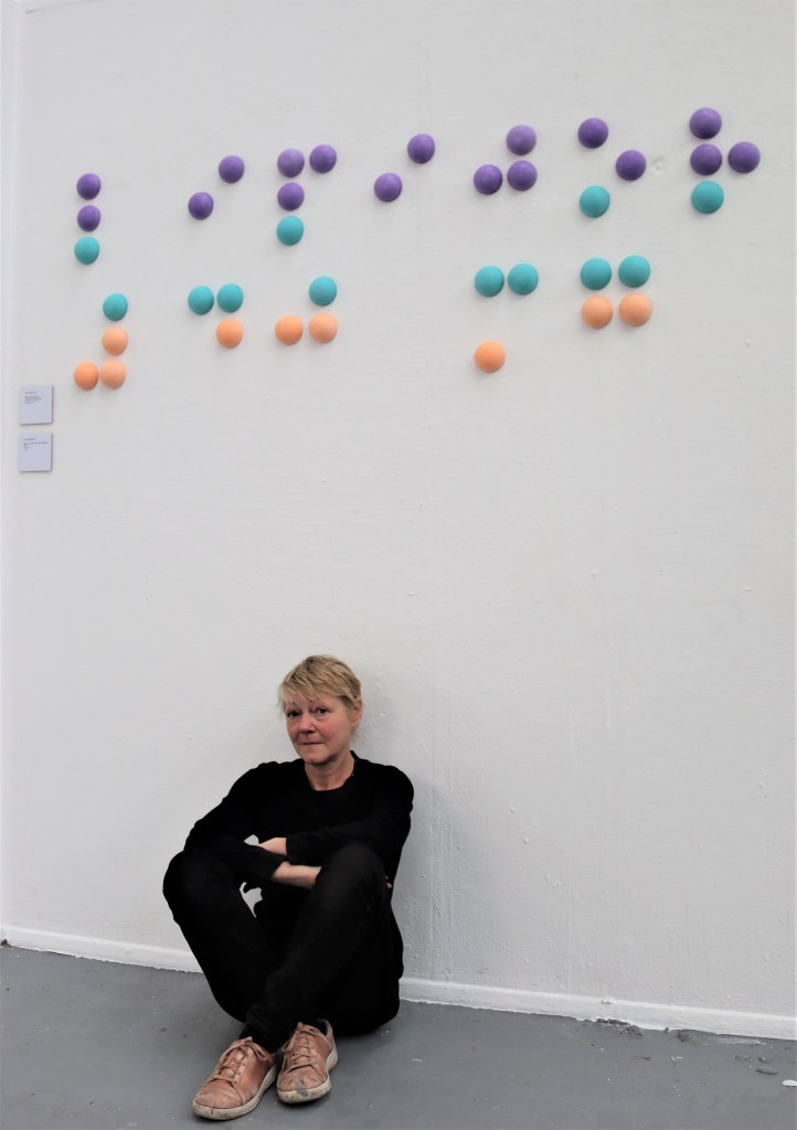
Primum non nocere Wall Installation
2023 Plaster and acrylic 138 x 60cm


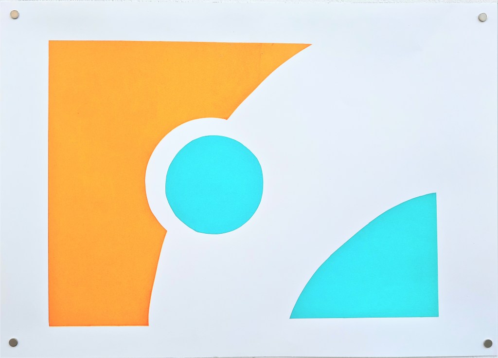
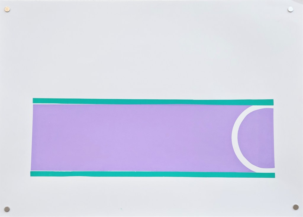
Can’t You See That Less is More?
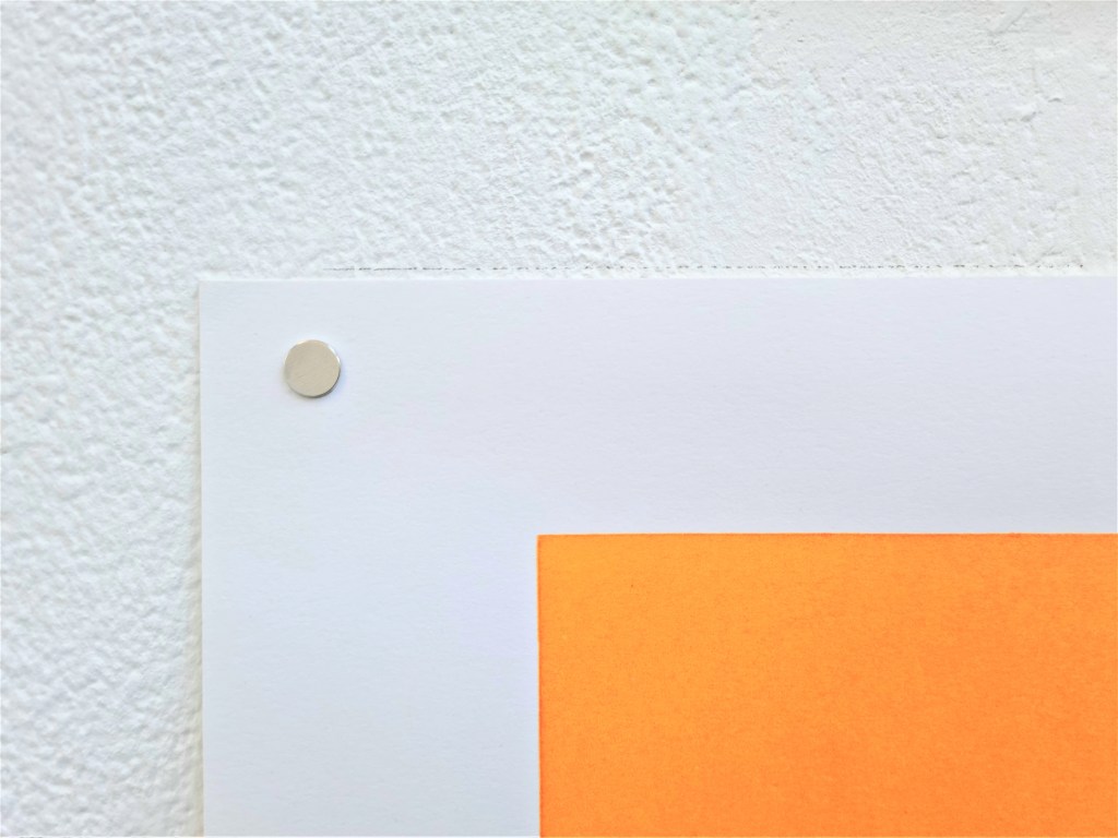
2023 Series of screen prints acrylic on cartridge paper Each A3 size

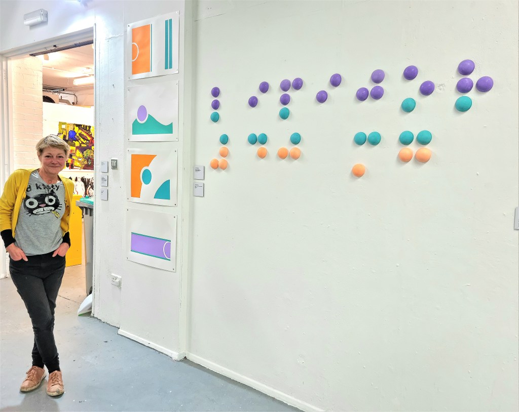
Primum Non Nocere Wall Installation/Can’t you See That Less is More?
RSA Feb 2023 Exhibition view

These works continue the exploration of palliative medical treatment. The pastel colours are those used on many medication packages and in hospital interiors. Gentle and appealing, they are intended to be soothing and give the feeling that you can trust and let go. But they can be seen as a veneer behind which is something very problematic. Cynics might say they are used as an intentional deceit – packaging something that is damaging in a way that makes it appealing. To lull you into acquiescence. Dependency and passivity makes people even more vulnerable. Dependency is deeply problematic.
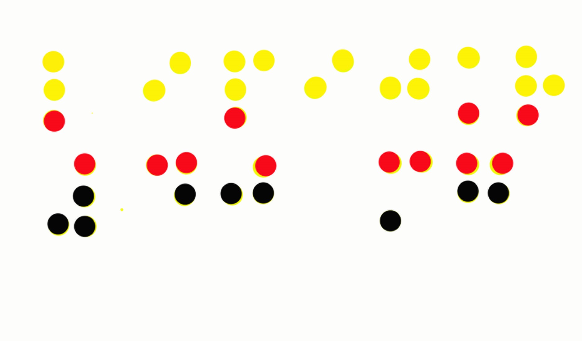
The prints take the shapes and colours of the medication boxes down to a pure abstract form. Although all text has been removed they are still readable – still recognizable as medical boxes, because these shapes and colours are now a code in modern society for pharmacuticals.
The wall installation is an abstraction of the medical box braille texts. In chalky plaster (evoking the material qualities of pills) it spells out the name and dosage of the medication – Lipitor 40mg . Unlike the earlier print works based on the braille in this installation it is now returned to it’s three dimensional form. But by completely removing it from it’s proper context and exploding the scale it is made even more unreadable – even more useless. Crucially though it elevates it from innocuous background to centre stage. It is yelling out the name of the drug – calling it out for what it is…. It can’t be ignored. It demands attention – but it will not be understood.
Both works are influenced strongly by modernism – with their focus on line, shape and colour and their extreme abstraction. They bring to mind Gary Hume’s abstracted hospital doors paintings. Progress in medicine means that we now have an incredible ability to extend human life through medication. Like the earlier print works, by setting end of life palliative medication in a modernist frame of reference they ask the question ”is this delivering the utopian ideals with which Modernism was associated?” Is prolonging life in this way really giving a better human experience?
For the show the two works were placed closely alongside each other. I would rather have had a much bigger space between them – but there were space restrictions so that was not possible. As a result I think they crowd each other.
The visual coding of the medication images can be transformed by changing the colour palette from the soothing to the colour code of danger/warning. A more honest representation?
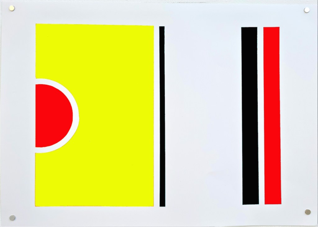
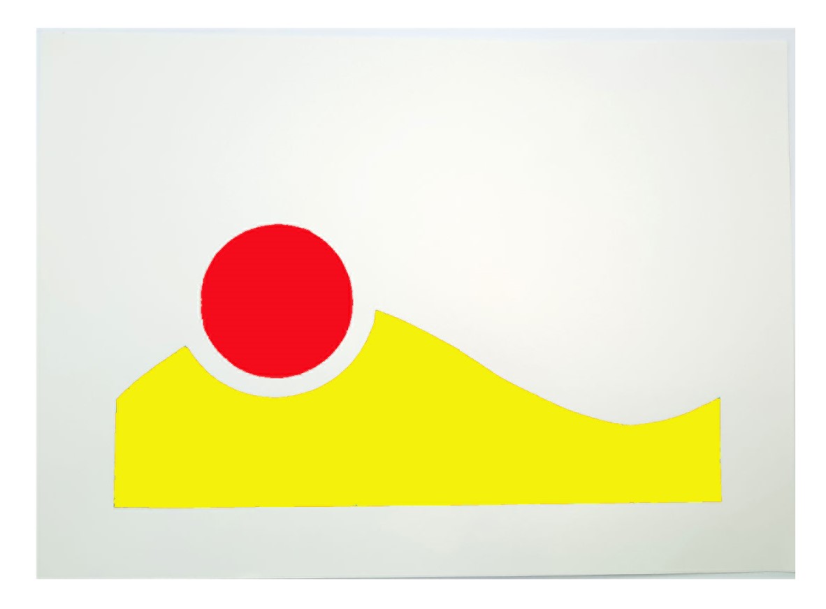


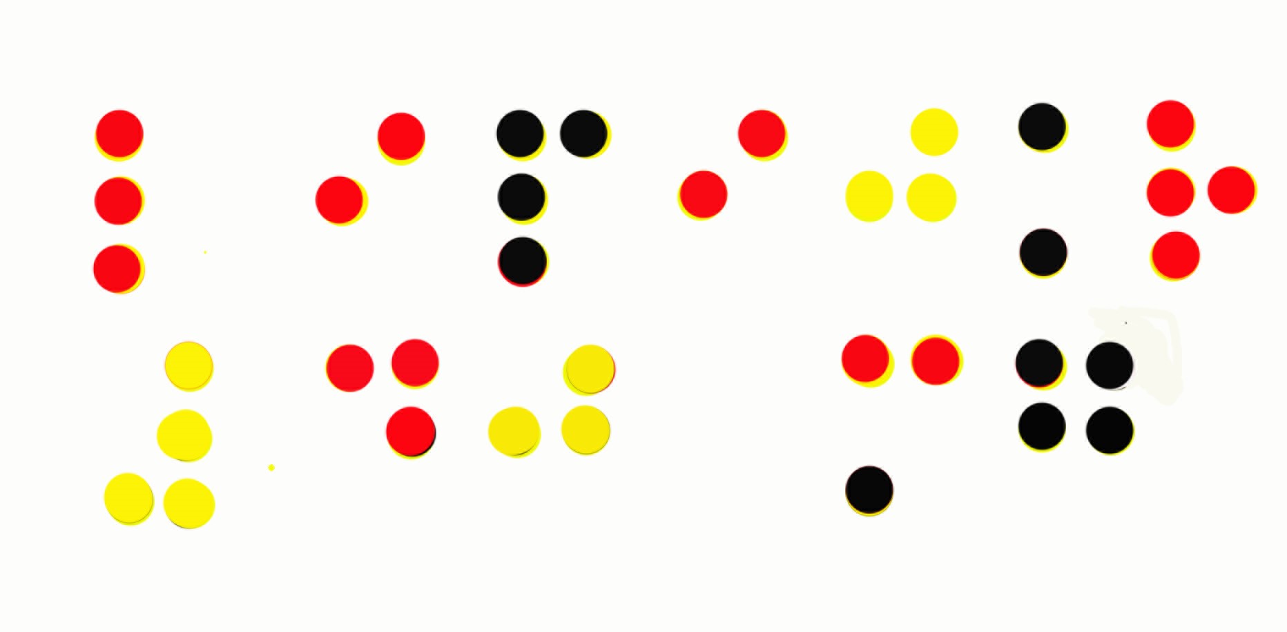

Digital images based on photographs of the screen prints
Key Research Sources: (click on each for details)
Gary Hume
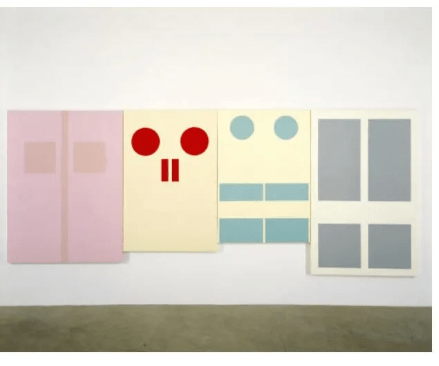
Gary Hume Hospital Doors – some of the works from the 1990’s series
Ruth Asawa

Ruth Asawa – Citizen of the Universe
Cornelia Parker

